


In a corporate setting, a gift box is never just a gift box. It’s a stand-in for your brand – arriving on someone’s desk and representing your company before you ever get to say a word. That’s the quiet pressure behind professional gift boxes: they have to look the part, because anything that feels cheap or thrown together says exactly that about the business that sent it.
We recently designed one that got the balance exactly right – a client gift for a national insurance company – and it’s a clean illustration of what separates a genuinely professional gift box from a merely nice one. Let’s take a closer look.
What makes a gift box look professional
Polish comes from a few deliberate things, and none of them is simply “spend more.” The first is cohesive branding: a professional gift box feels like an extension of the company, not a generic box with a sticker slapped on – the colors, the logo, and the finish all speaking the same language. The second is restraint. Professional rarely means loud; it means clean, considered, and confident, trusting a few quality pieces rather than crowding the box. And the third is quality you can feel – real materials, proper weight, packaging that holds its shape. Get those three right and a gift box reads as professional before a single item is lifted out.
A professional gift box, up close
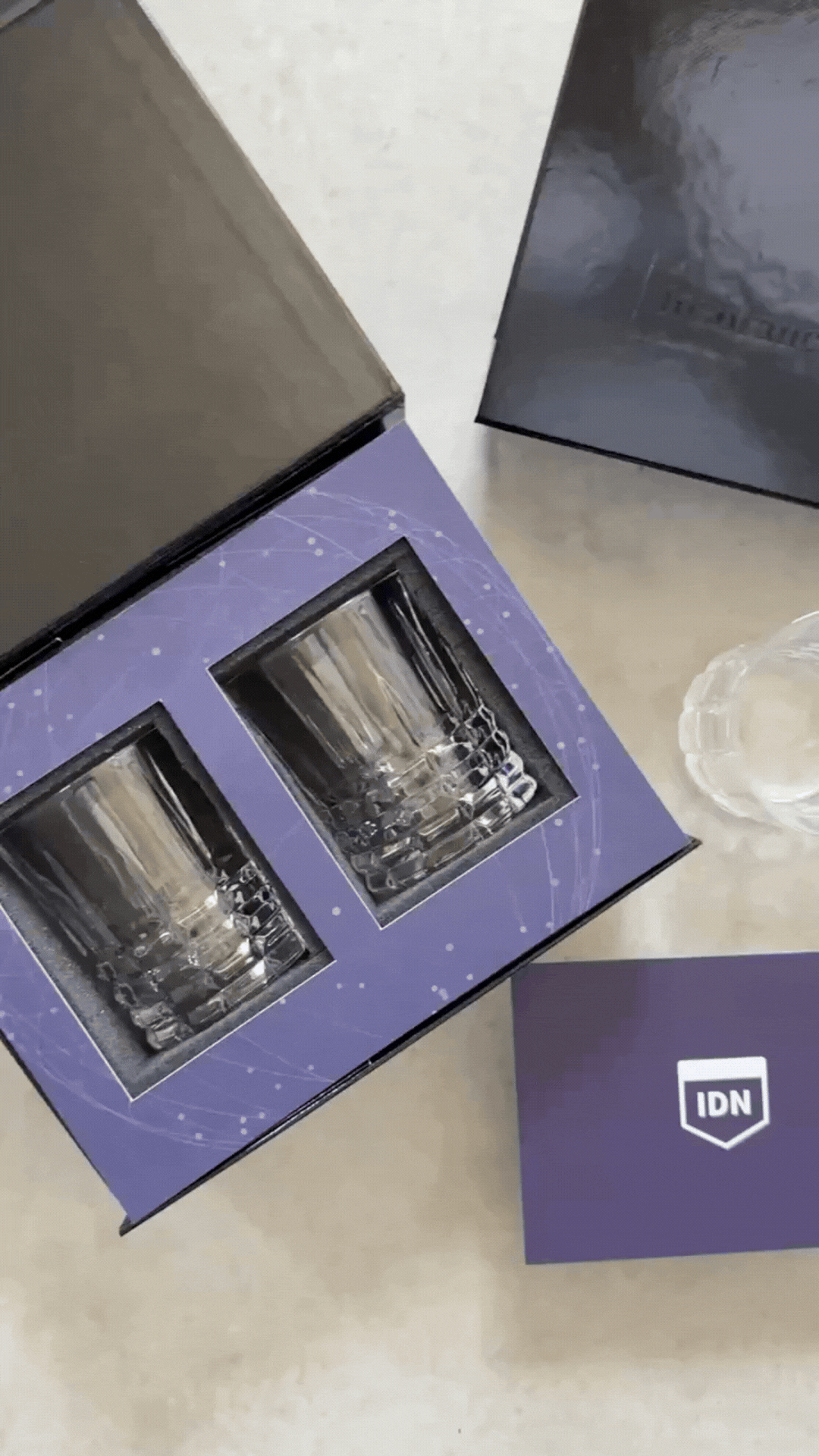
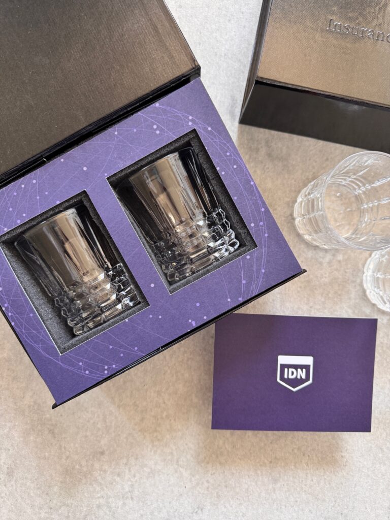
This one made its impression immediately. It arrived in a rigid, magnetic-close box with a soft-touch finish and the client’s shield logo embossed cleanly into the lid – restrained, corporate, and unmistakably theirs.
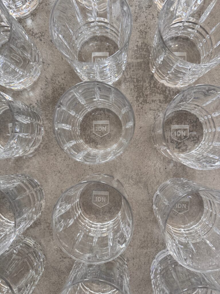
Lifting it open revealed a fully custom-printed interior in deep purple, patterned with a delicate web of connected points: a subtle nod to the “network” at the heart of the brand. Two cut-crystal rocks glasses sat cradled in die-cut foam, each etched on the base with the same shield logo, beside a custom insert card. Everything matched. Everything had a reason to be there. That head-to-toe consistency is exactly what separates professional gift boxes from boxes that simply hold nice things.
Why the details read as professional
Look closely and every choice reinforces the same impression. The rigid box signaled a company that takes presentation seriously. The custom interior tied the gift unmistakably to one brand. The etched crystal carried the logo with quiet confidence rather than a slapped-on print. And the restraint – two beautiful glasses, a card, nothing extra – gave the whole thing a composed, executive feel.
This is the part that trips companies up. In trying to look generous, they overfill, and the result feels busy instead of polished. The most professional gift boxes do the opposite: they say less, and mean more.
Why the polish is worth it
It’s tempting to treat presentation as a nice-to-have – the first thing you trim when budgets tighten. But for a client-facing gift, the packaging is doing real work. It’s often the first tangible thing a client touches from your company, and first impressions in business tend to stick. A polished, professional gift box signals that you sweat the details – exactly what people hope for in a company they’re trusting with their money, their data, or their reputation. A careless one quietly signals the opposite. The box, in other words, is part of the message.
What professional gift boxes get right
If there’s a lesson in this box, it’s that “professional” is a design outcome, not a budget. The most professional gift boxes are cohesive, restrained, and well made – and that combination communicates competence and care long before the recipient ever pours a drink.
That’s the standard Box+Wood builds to. We design fully managed, white-labeled professional gift boxes around your brand – custom packaging, branded glassware, precise assembly, and shipping all handled – so what lands on your client’s desk represents you exactly the way you’d want. Let’s design yours.


